You have written this component before. Probably a dozen times.
A modal. Click to open, Escape to close, click the backdrop to dismiss. Trap focus inside so tabbing doesn't wander off into the page behind it. Return focus to the button that opened it. Lock body scroll. Flip aria-expanded. Fight the z-index so it actually sits on top. It's maybe forty lines, and every single time at least one of those behaviors ships subtly broken: focus doesn't return, the background still scrolls on iOS, or a screen reader announces stale state.
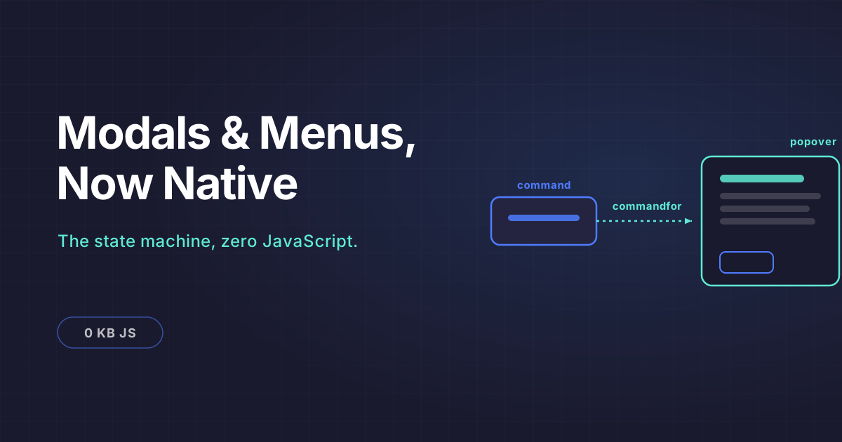
As of 2026 you can delete almost all of it. The browser runs that state machine now, correctly, across every engine. This post is about the behavior layer that makes it possible: the Popover API plus the new invoker commands (command and commandfor), and, just as important, the honest line on what the platform still does not do for you.
Why this is different from anchor positioning
If you read the earlier post on CSS anchor positioning, keep the two ideas separate in your head.
Anchor positioning is geometry. It answers where a floating element sits relative to its trigger, replacing the measuring loops you used to run through Floating UI or Popper.
This is state. It answers how the thing opens, closes, stacks, traps focus, and light-dismisses. Anchor positioning places it. Popover plus commands make it behave. You want both, and they compose cleanly, but they solve different problems.
The forty lines, before and after
Here is the modal most of us have shipped, trimmed to the essentials and still not covering every edge case:
const trigger = document.querySelector("#openSettings");
const dialog = document.querySelector("#settingsDialog");
const closeBtn = dialog.querySelector(".close");
let lastFocused = null;

function open() {
  lastFocused = document.activeElement;
  dialog.hidden = false;
  document.body.style.overflow = "hidden";
  trigger.setAttribute("aria-expanded", "true");
  dialog.querySelector("input, button")?.focus();
  document.addEventListener("keydown", onKeydown);
  dialog.addEventListener("click", onBackdrop);
}

function close() {
  dialog.hidden = true;
  document.body.style.overflow = "";
  trigger.setAttribute("aria-expanded", "false");
  lastFocused?.focus();
  document.removeEventListener("keydown", onKeydown);
}

function onKeydown(e) {
  if (e.key === "Escape") close();
  // ...and here is where you hand-write a focus trap you will get wrong
}

function onBackdrop(e) {
  if (e.target === dialog) close();
}

trigger.addEventListener("click", open);
closeBtn.addEventListener("click", close);
The focus trap is the part everyone botches. You have to find the first and last tabbable elements, wrap Tab and Shift+Tab, and keep that list current as the dialog's contents change. Most hand-rolled traps miss disabled elements, elements with tabindex="-1", or content that mounts after open.
Now the native version:
<button command="show-modal" commandfor="settingsDialog">
  Settings
</button>

<dialog id="settingsDialog">
  <h2>Settings</h2>
  <!-- fields -->
  <button command="close" commandfor="settingsDialog">Done</button>
</dialog>
Zero JavaScript. The command="show-modal" attribute tells the browser to call showModal() on the element named by commandfor. Chrome's own guidance puts it plainly: wiring command and commandfor to a button means the browser automatically handles the open/close state changes, focus management, and accessibility bindings.
Count what disappeared. The scroll lock, the focus save and restore, the Escape handler, the backdrop-click listener, the aria-expanded toggling, and the focus trap are all gone. showModal() puts the dialog in the top layer, renders ::backdrop behind it, makes the rest of the page inert, moves focus in, and returns it to the trigger on close. These are guarantees now, not code you maintain.
What command and commandfor actually are
Invoker commands add two HTML attributes to buttons (and button-type inputs). command names the action; commandfor points to the target element's id. The browser performs the action with no script.
The built-in dialog commands map straight to the imperative API. show-modal calls showModal(), close calls close(), and request-close calls requestClose(). There is deliberately no show command, so you cannot open a non-modal dialog this way. That is a design choice, not an oversight, and it nudges you toward popovers for non-modal surfaces.
For popovers the commands are show-popover, hide-popover, and toggle-popover, mapping to showPopover(), hidePopover(), and togglePopover().
If you have used popovertarget and popovertargetaction before, those still work. But command and commandfor are the more general mechanism, because the same syntax drives both <dialog> and [popover], and, as you'll see, your own custom actions too.
A dropdown menu with no outside-click listener
Menus are where the top layer earns its keep. The popover attribute has three values worth knowing: auto gives you light-dismiss, meaning a click outside or an Escape press closes it; manual stays open until you explicitly close it; and hint is for hint and tooltip-style surfaces.
<button command="toggle-popover" commandfor="accountMenu">
  Account
</button>

<div id="accountMenu" popover="auto">
  <a href="/profile">Profile</a>
  <a href="/billing">Billing</a>
  <button command="show-modal" commandfor="logoutDialog">Log out</button>
</div>
No document-level click listener to close on outside click. No z-index. Because the popover renders in the top layer, it escapes overflow: hidden and stacking contexts that used to clip dropdowns inside scroll containers. Light-dismiss and Escape come from popover="auto" for free. And to place the menu under its trigger, you reach for anchor positioning from the other post. One layer positions, this layer behaves.
Notice the last item opens a modal dialog from inside the menu, mixing both mechanisms with the same attribute syntax.
Intercepting a close: the unsaved-changes guard
This is the pattern people assume you still need JavaScript for, and you barely do. requestClose() differs from close() in one important way: it fires a cancel event first, and if you call preventDefault() in that handler, the close is blocked. It has been Baseline since May 2025.
<dialog id="editorDialog">
  <form>
    <textarea id="draft"></textarea>
    <button command="request-close" commandfor="editorDialog">Close</button>
  </form>
</dialog>
const dialog = document.getElementById("editorDialog");
dialog.addEventListener("cancel", (e) => {
const draft = document.getElementById("draft");
if (draft.value.trim() && !confirm("Discard your draft?")) {
e.preventDefault(); // stays open
}
});The button stays declarative. The only script is the actual decision, which is your business logic, not plumbing. The cancel event also fires on Escape, so the guard covers that path with no extra work. Popovers have their own cancelable hook, beforetoggle, which carries newState and oldState and can be prevented to block opening.
Custom commands for your own actions
Here is the part that turns this from a dialog feature into a general invoker system. You can define your own commands. They must be prefixed with two dashes, and instead of a built-in behavior they dispatch a command event on the target.
<button command="--like" commandfor="post-4821">Like</button>
<article id="post-4821"><!-- ... --></article>
const post = document.getElementById("post-4821");
post.addEventListener("command", (e) => {
if (e.command === "--like") {
likePost(post.dataset.id, { via: e.source });
}
});Two details will save you an afternoon of debugging. event.command includes the -- prefix, so match on "--like", not "like". And CommandEvent does not bubble. Listen on the target element itself, never on document or window, or your handler will never fire.
The decision rule: modal, auto, or manual
Three surfaces, three choices, and mixing them up produces the wrong semantics for assistive tech.
Reach for <dialog> with show-modal when the surface demands the user's full attention and should block the page: confirmations, destructive-action prompts, focused editors. You get the inert background and focus trap precisely because it is modal.
Reach for popover="auto" for non-modal surfaces the user can casually dismiss by clicking away: dropdown menus, toasts, disclosure widgets, comboboxes. The page stays live behind them.
Reach for popover="manual" when the surface must not close on outside click, like a multi-step onboarding coach mark or a media control that stays put until the user acts. You own the close.
One nuance: <dialog popover> is valid, and it can be tempting to blur the line. Resist it. If the interaction should trap focus and block the page, use show-modal. If it should not, use a popover. Choosing modal semantics for something that isn't modal is the accessibility bug, just a quieter one than the z-index war you replaced.
Where the "no JavaScript" claim stops being honest
I have watched enough platform features get oversold to want to draw this line clearly.
Native support wires ARIA states like aria-expanded for you. Polyfills do not. Chrome's guidance is blunt about it: with a polyfill you are strongly encouraged to handle those states yourself. So the moment you polyfill for older engines, part of the accessibility you thought was automatic becomes your job again.
Feature-detect before you polyfill. Check 'commandForElement' in HTMLButtonElement.prototype for invoker commands, and the popover property on HTMLElement.prototype for the Popover API. The recommended polyfills are invokers-polyfill and @oddbird/popover-polyfill. One sharp edge: the popover polyfill exposes the state as .\:popover-open rather than the native :popover-open, so combine both with :is() or :where() if you style the open state, otherwise the selector silently no-ops in one environment or the other.
And the tooltip story is not finished. Hover and focus tooltips want interest invokers, the interestfor attribute with its interest and loseinterest events and interest-delay CSS. That is still experimental, sitting behind a flag in Chrome 139 and up, and nowhere near Baseline. If someone tells you the native stack does declarative hover tooltips today, they are describing a flag, not a shipped feature.
For progressive enhancement, the JS equivalents of the attributes exist when you need them: button.commandForElement = dialog and button.command = "show-modal" set the same wiring from script.
Why "hand-rolled" is now the buggy path
The support math is what flips the default. The Popover API went Baseline newly available in January 2025. Invoker commands landed in Chrome and Edge 135 in April 2025, Firefox 144 in October 2025, and Safari 26.2 in December 2025, which was the last engine to fill the gap. requestClose() has been Baseline since May 2025. This is not a bleeding-edge experiment you adopt at risk. It is the boring, cross-browser default.
Which changes who carries the burden of proof. For years the hand-written modal was the safe, understood choice and the platform version was the gamble. That has inverted. Your custom focus trap is now the thing most likely to be subtly wrong, because the browser's implementation has been tested against assistive tech far more thoroughly than your forty lines ever will be.
Delete the plumbing. Keep the two things that are genuinely yours: the business decision inside a cancel handler, and the ARIA states you must still manage when a polyfill is in play. Everything between those two is the browser's job now, and it does it better than we did.